Apollo magazine
Redesigning the website of the iconic art magazine
product design
mark porter associates
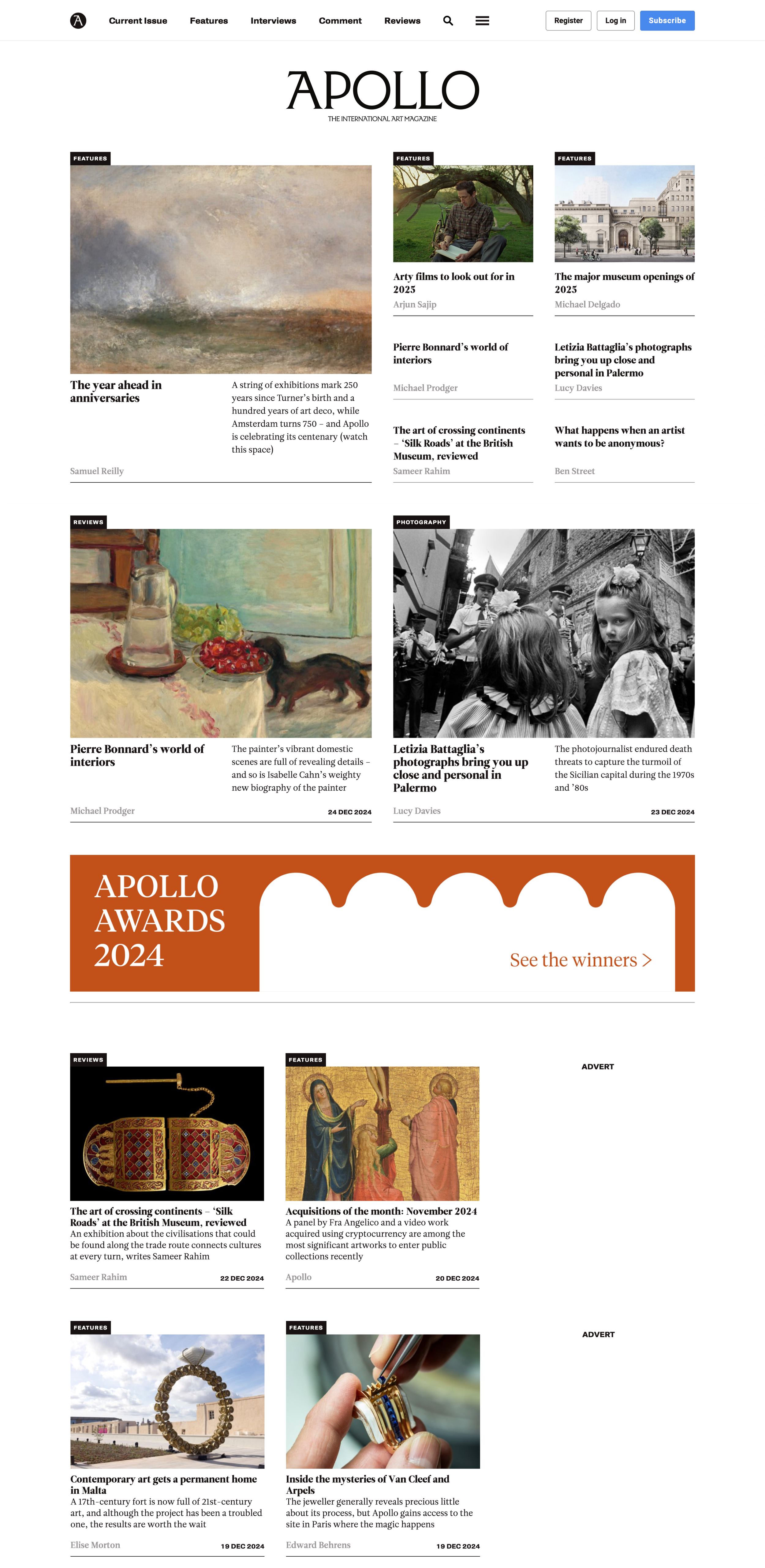
(top of the homepage) before
The previous design lacked hierarchy and everything looked pretty similar regardless of it being a feature, a review or a news story.
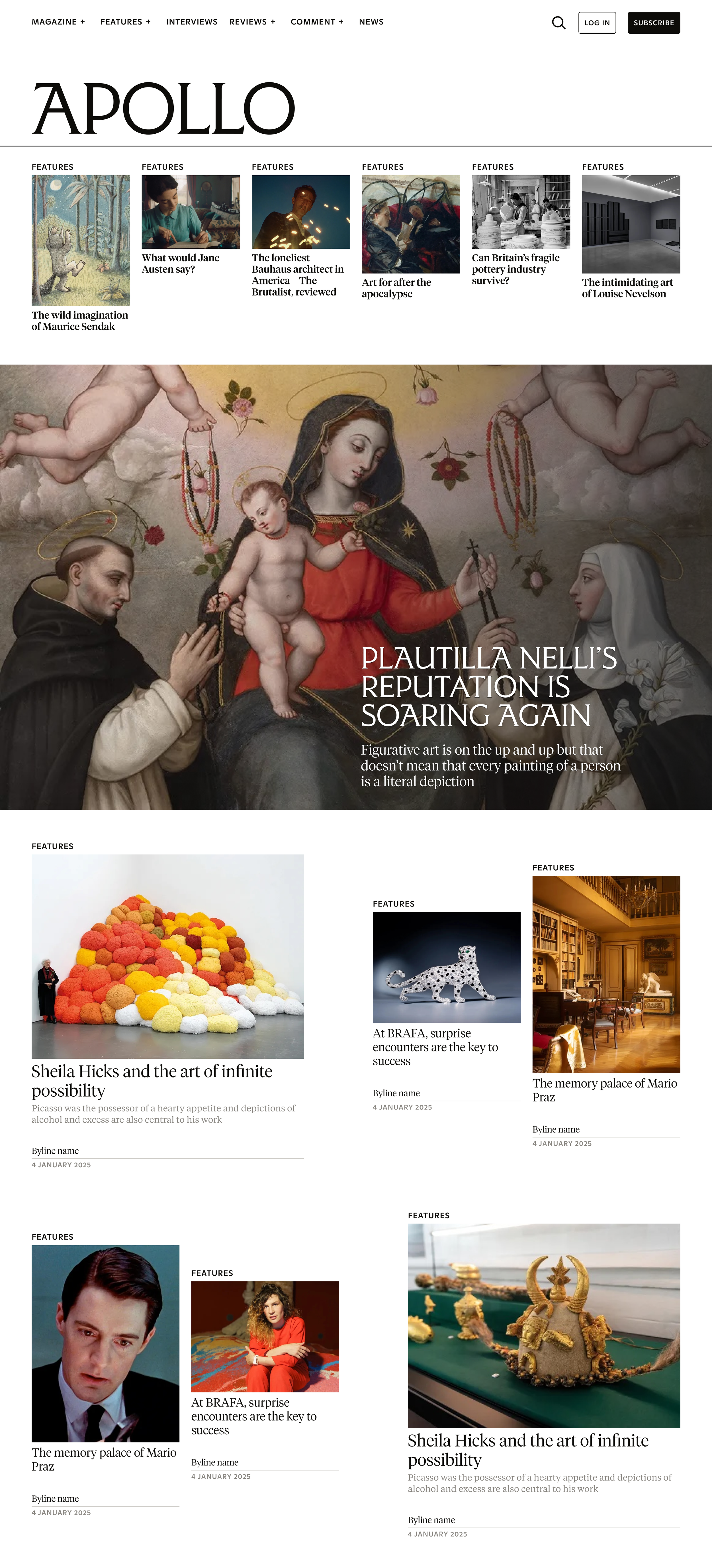
(top of the homepage) after
The new design proposes different containers and card sizes for the magazine features, allowing readers to quickly see what they should care about first.

Taking inspiration from the print masthead, we commissioned Commercial Type to create a typography we could use in special sections of the website.
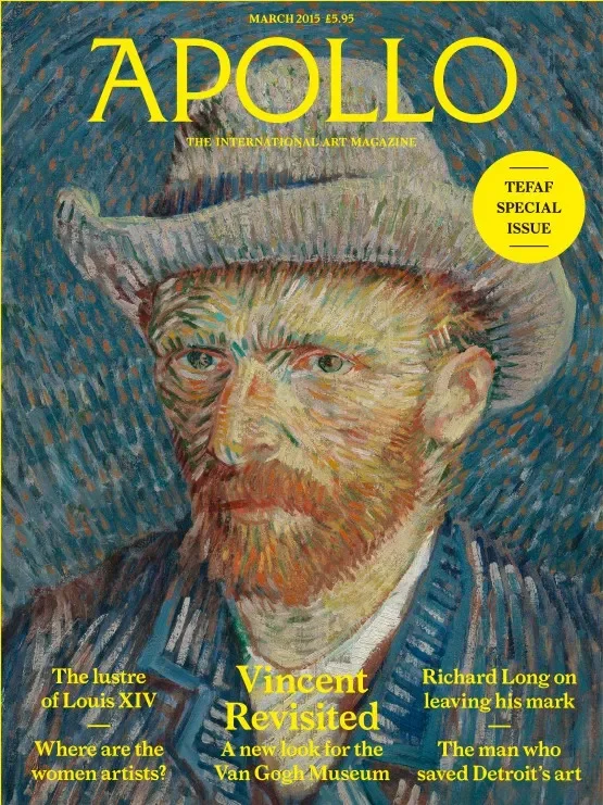
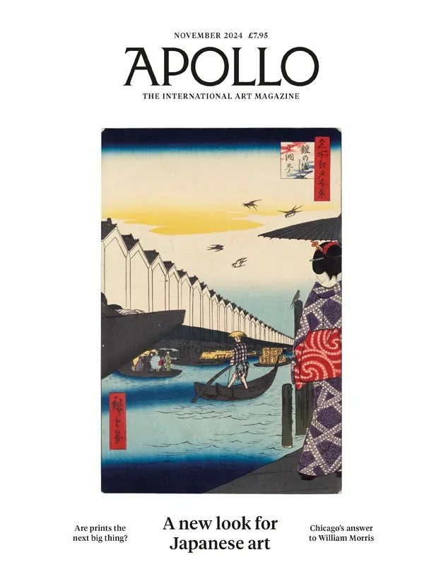
left: nov 2024. right: march 2015
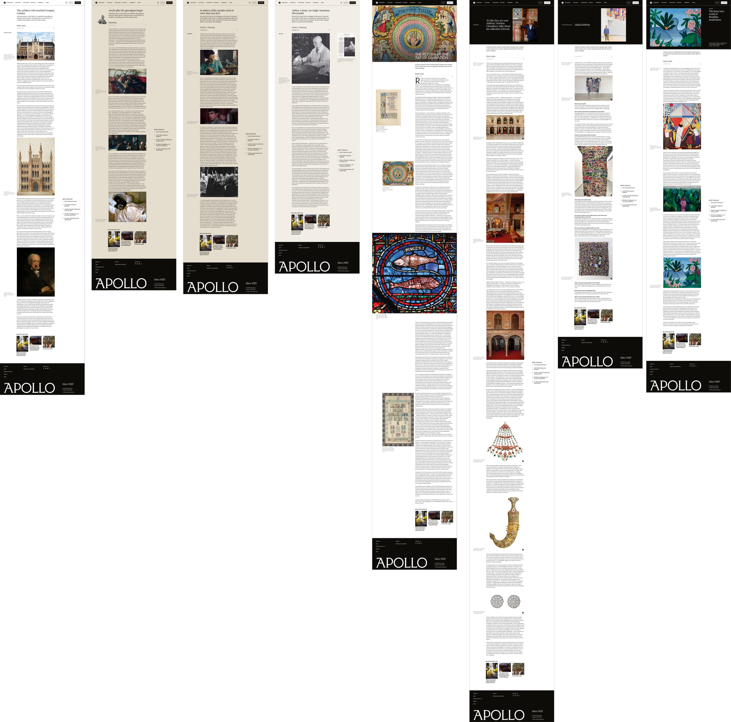
article templates.
Left to right: standard, rakewell, comment, archive, feature, interview, “in the studio with”, review