


Feast’s design system
“The systematic approach (Ana) has taken and the high standards she has set not only streamline engineering efforts but also seamlessly integrate with our broader design ecosystem.
Ana’s diligence in this area is greatly appreciated and has significantly enhanced the project’s overall quality.”
design system product design
the guardian,uk
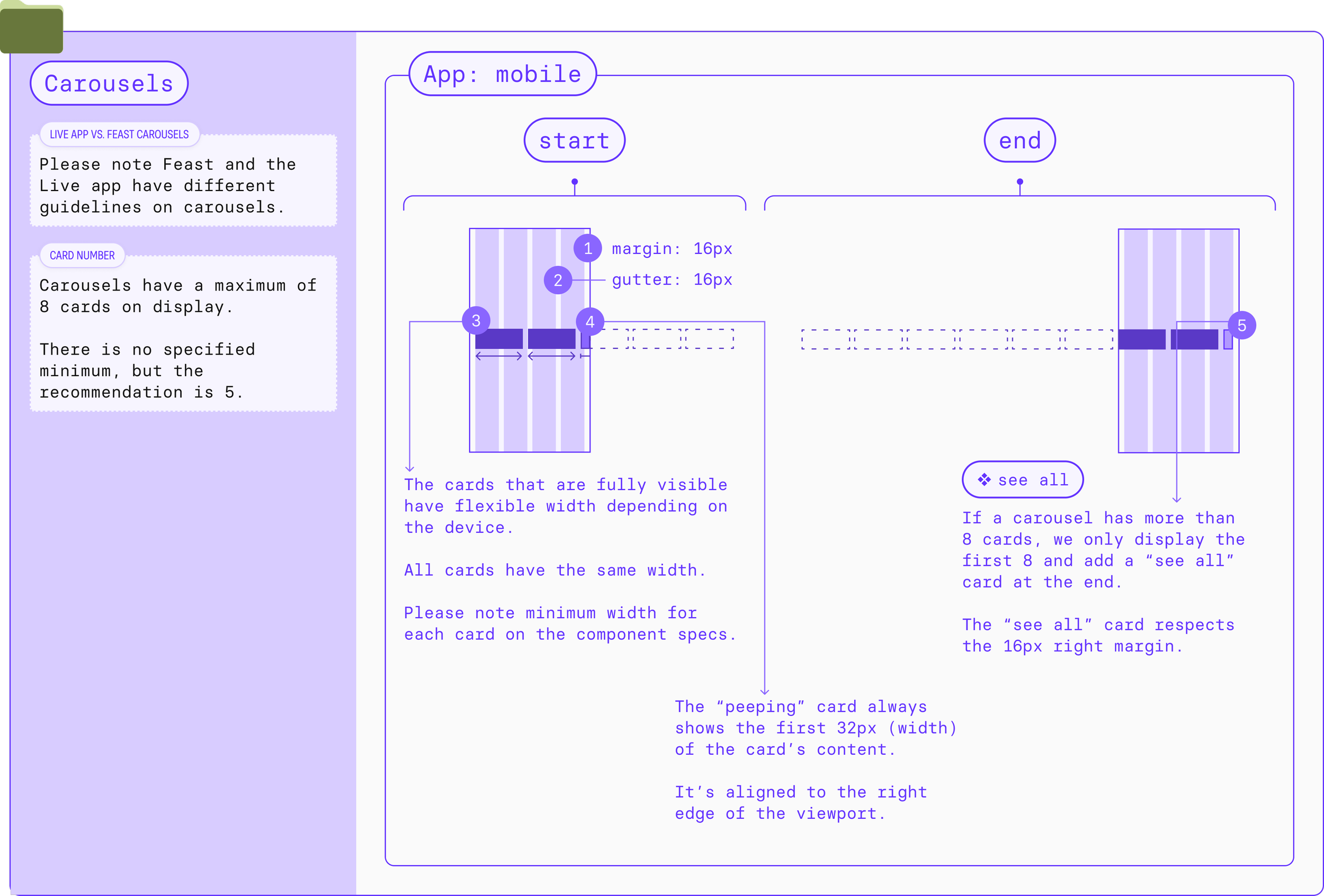
Building a robust design system that can handle quick, multiple design and tech iterations
The basecamp (a.k.a. innovation) team at the Guardian was tasked in July 2023 with creating a new revenue source around food & drink content.
We didn’t know what the product would look or feel like and what technology we would use to build it but we had 6 months and limited resources.
The feast DS has enabled the team to:
Update the branding (twice) across the app in record time whilst keeping our design standards and reaching the team’s milestones.
Be consistent across screens, devices and operating systems.
Implement a UI that works seamlessly in both light and dark mode
Integrate the product with the wider Guardian’s values and design systems.
● challenges
[1]: available systems
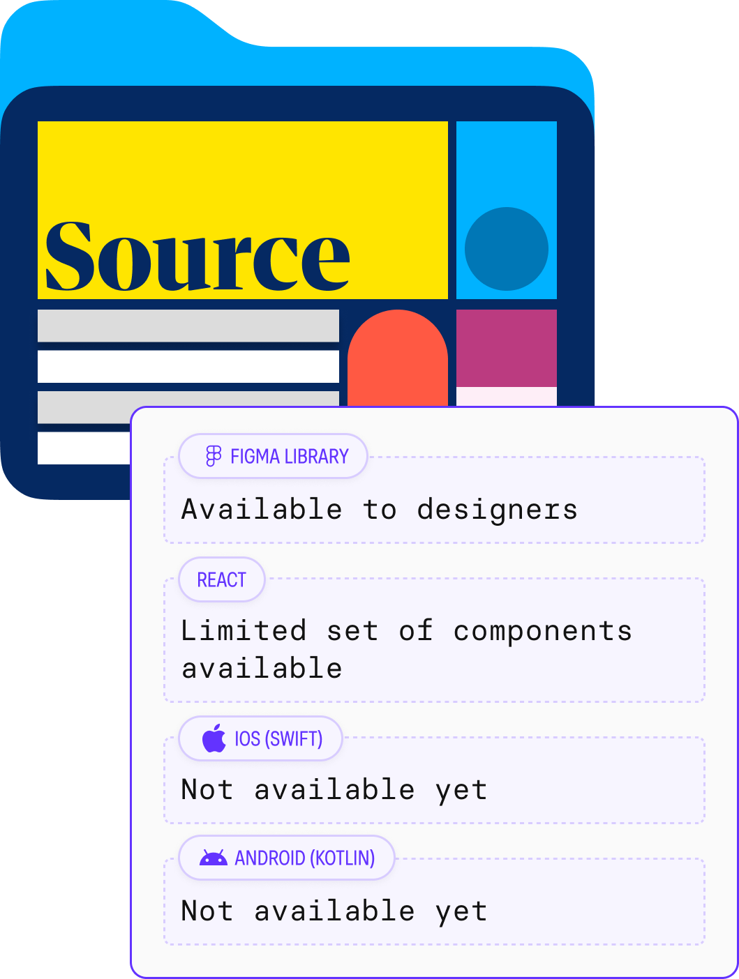
Using the Guardian’s existing design system solely was not an option. It focused mainly on the newspaper brand, the website(not apps) and had disparity of availability between design (Figma) and code (React).
[2]: code
In September 2023, we were considering a web-first approach.
In November 2023, we were considering building an app using Flutter.
In December 2023, we decided to take a native approach. This meant two code bases and having dark mode by default on iOS.
[3] design
We changed the branding twice between November 2023 and February 2024.
[4] limited resources
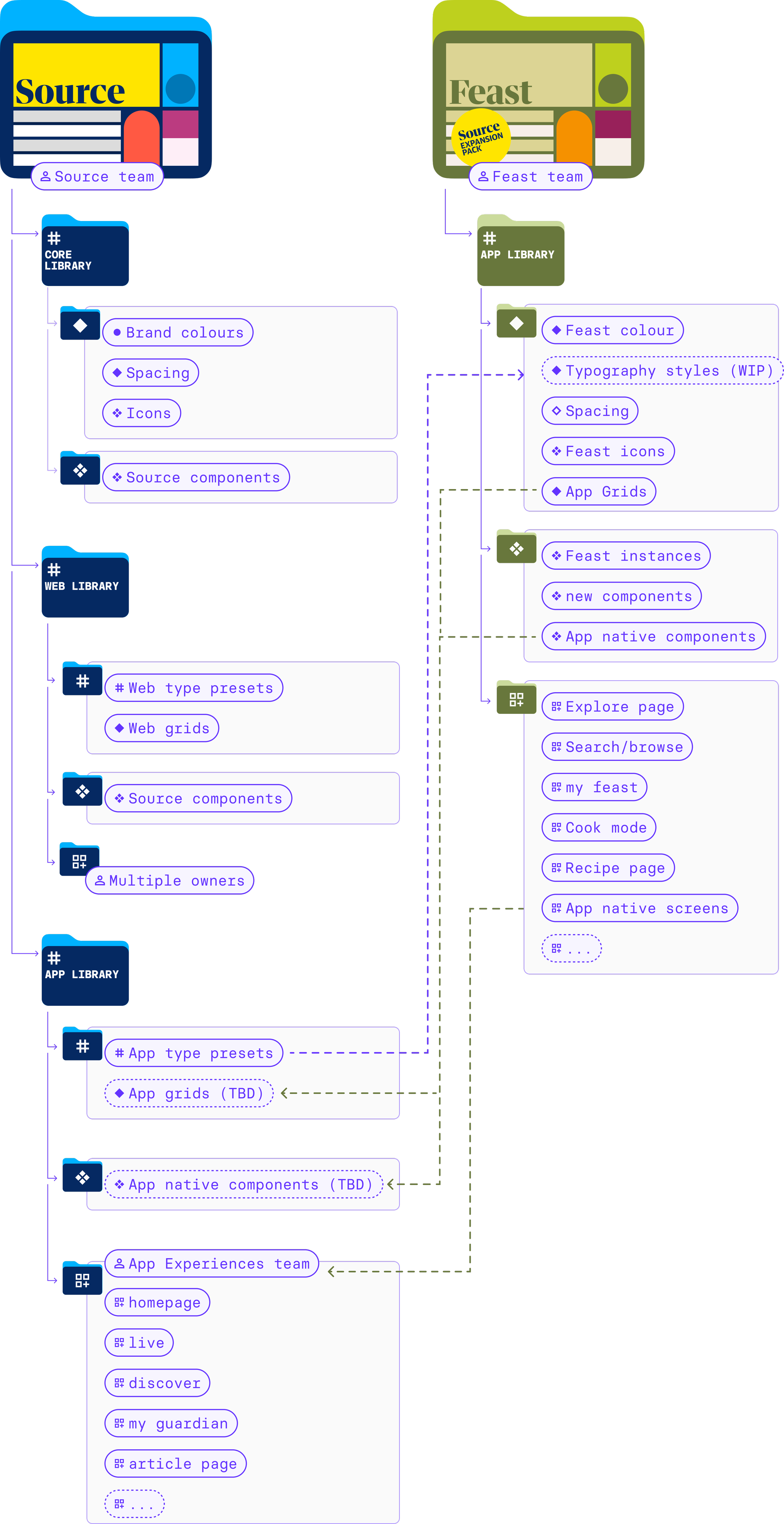
Across both Source and Feast teams.
[5] team structure
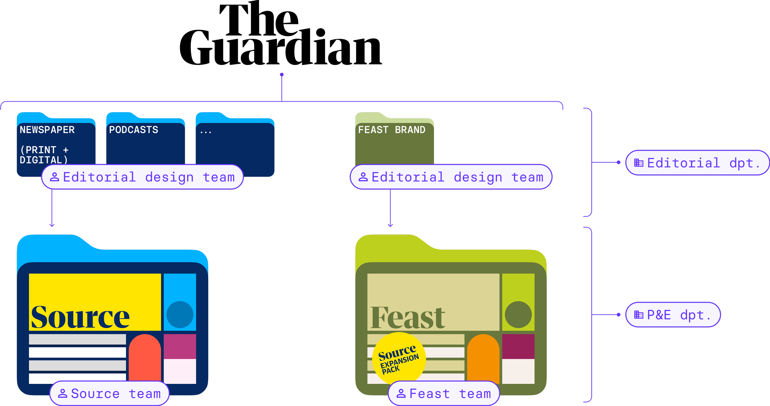
The branding is created by the editorial design team (which sits in a different department).
The existing design system for the newspaper is maintained by the “Source team”.
The Feast app team working in a separate huddle at a faster pace.
The fact that readers don’t know this work is done by separate teams.
● strategy
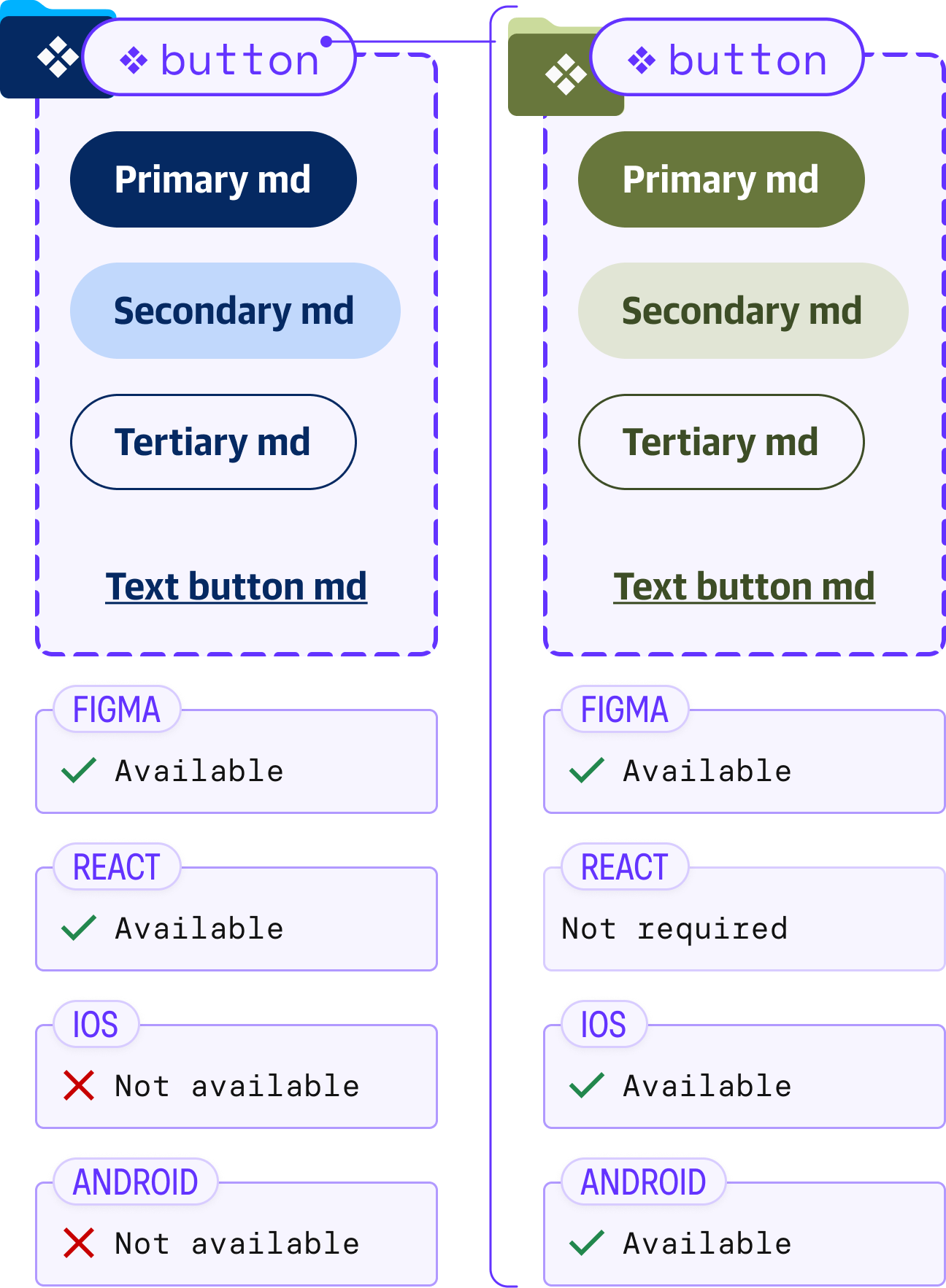
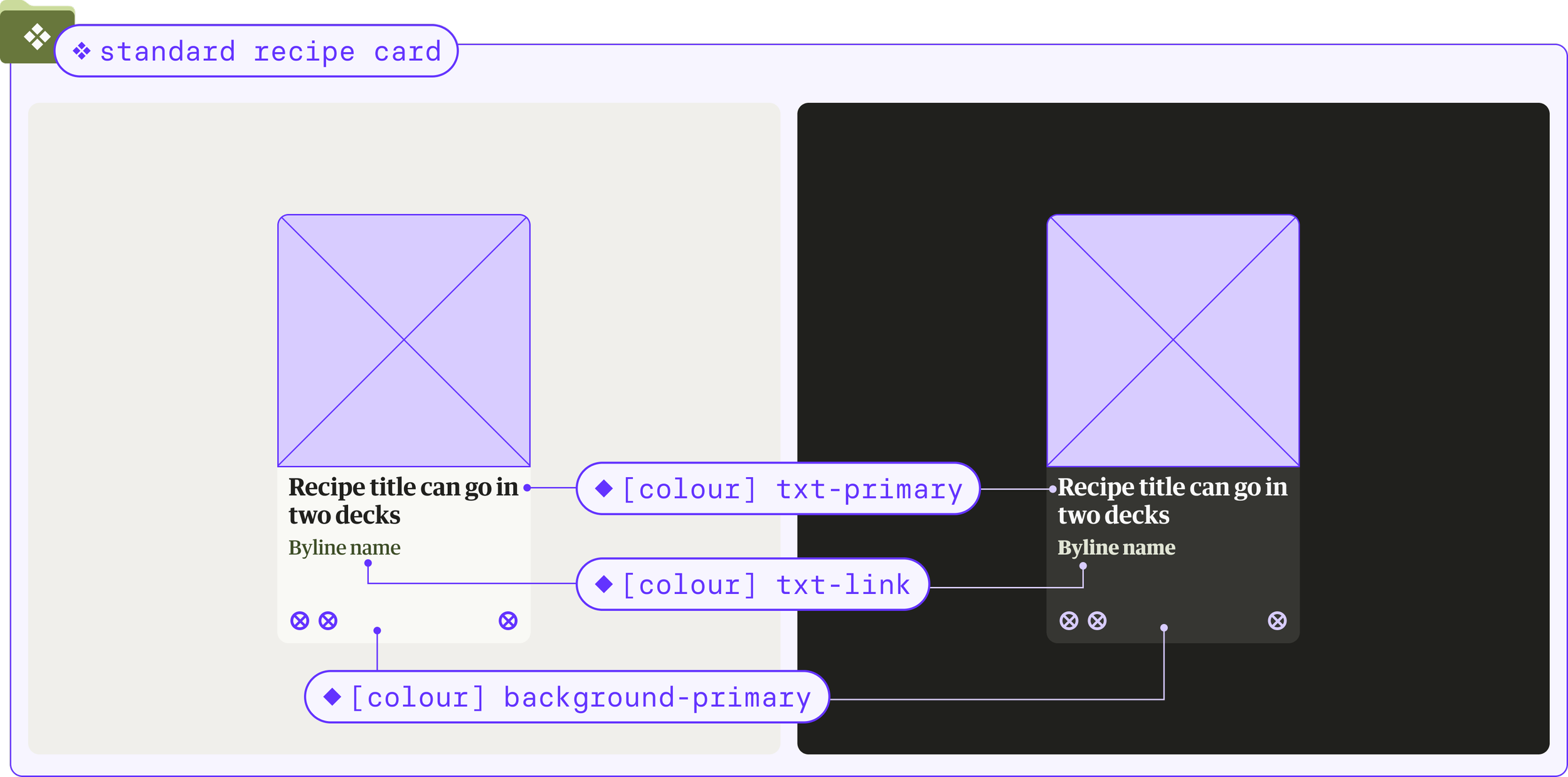
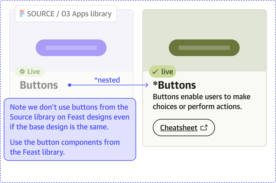
For components that already existed in Source, we used instances with a layer of customisation.Use design tokens anywhere we can.
Reuse whenever possible: create instances of Source components with a layer of Feast customisation.
Develop elements in a way that they can be fed back into Source in the future.
“Piggy back” on guidance from Apple (Human interface guidelines) and Android (Material design guidelines) to develop native approaches.
● set up
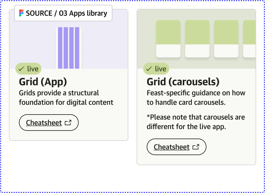
We divided all the elements of the design system into separate Figma libraries that could be published independently.
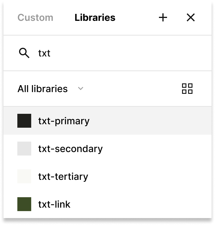
We use design tokens as much as possible. Despite requiring an initial set up effort, they enable us to create a robust system that can easily be updated and maintained across both design and code.


Primitives are the raw values we use in our designs: a hex code, the rbga for a colour, a number of pixels, etc.
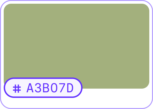
For example #A3B07D

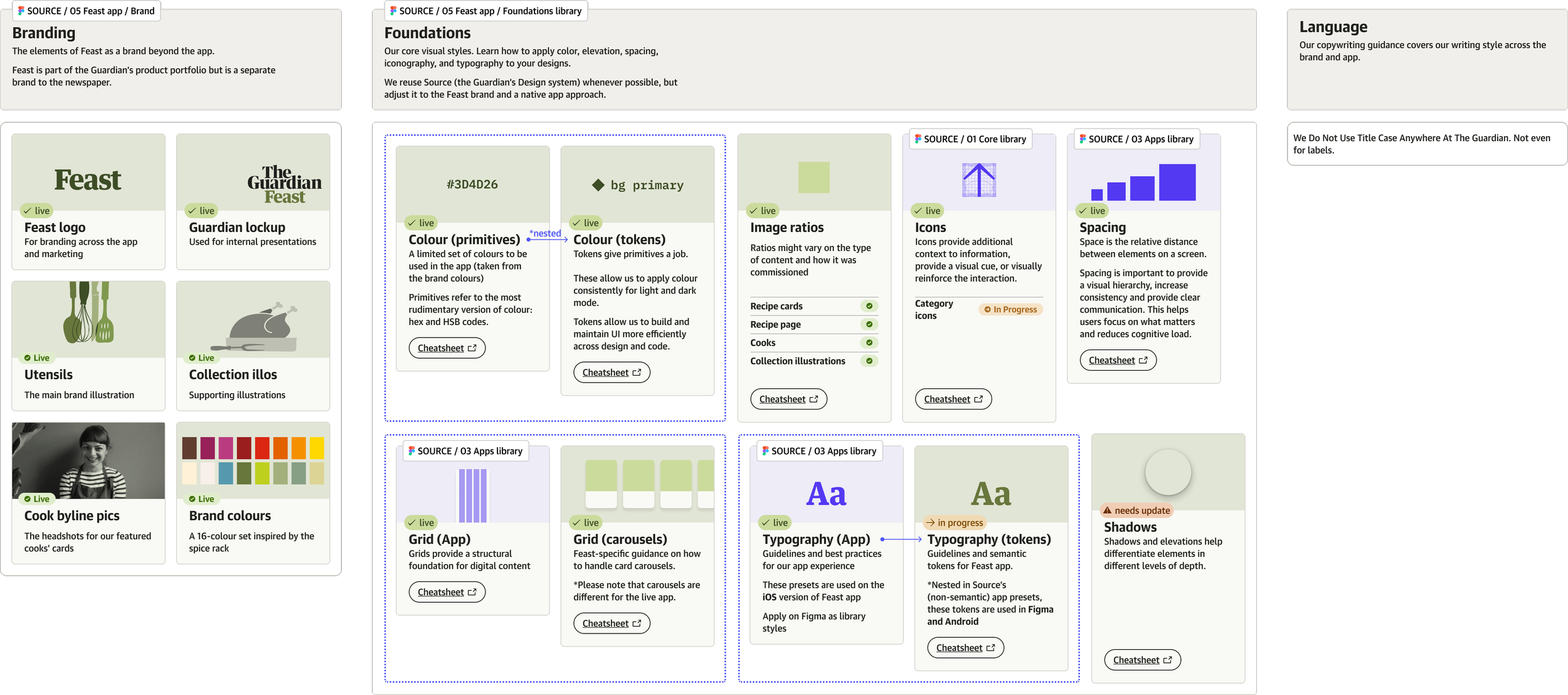
Foundations are our core visual styles. They show how to apply color, elevation/shadows, spacing, iconography, and typography to your designs.
We reuse Source (the Guardian’s Design system) whenever possible, but adjust it to the Feast brand and a native app approach.
For example #A3B07D becomes a colour in a scale from dark (100) to light (900) to inform designers how it should be used and provide extra details, like accessibility.

Tokens give our foundations a specific job and use a shared language between design and code.

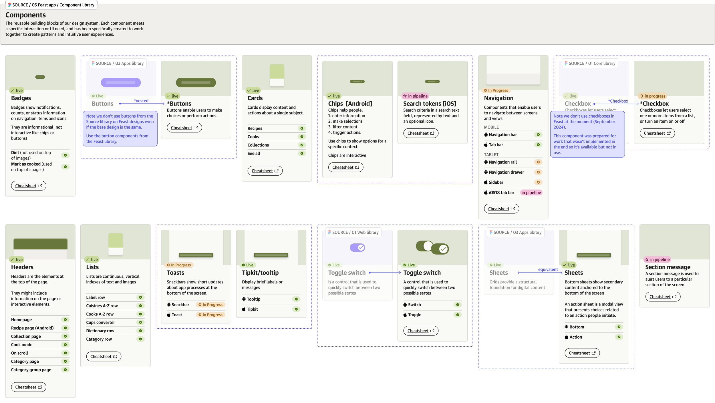
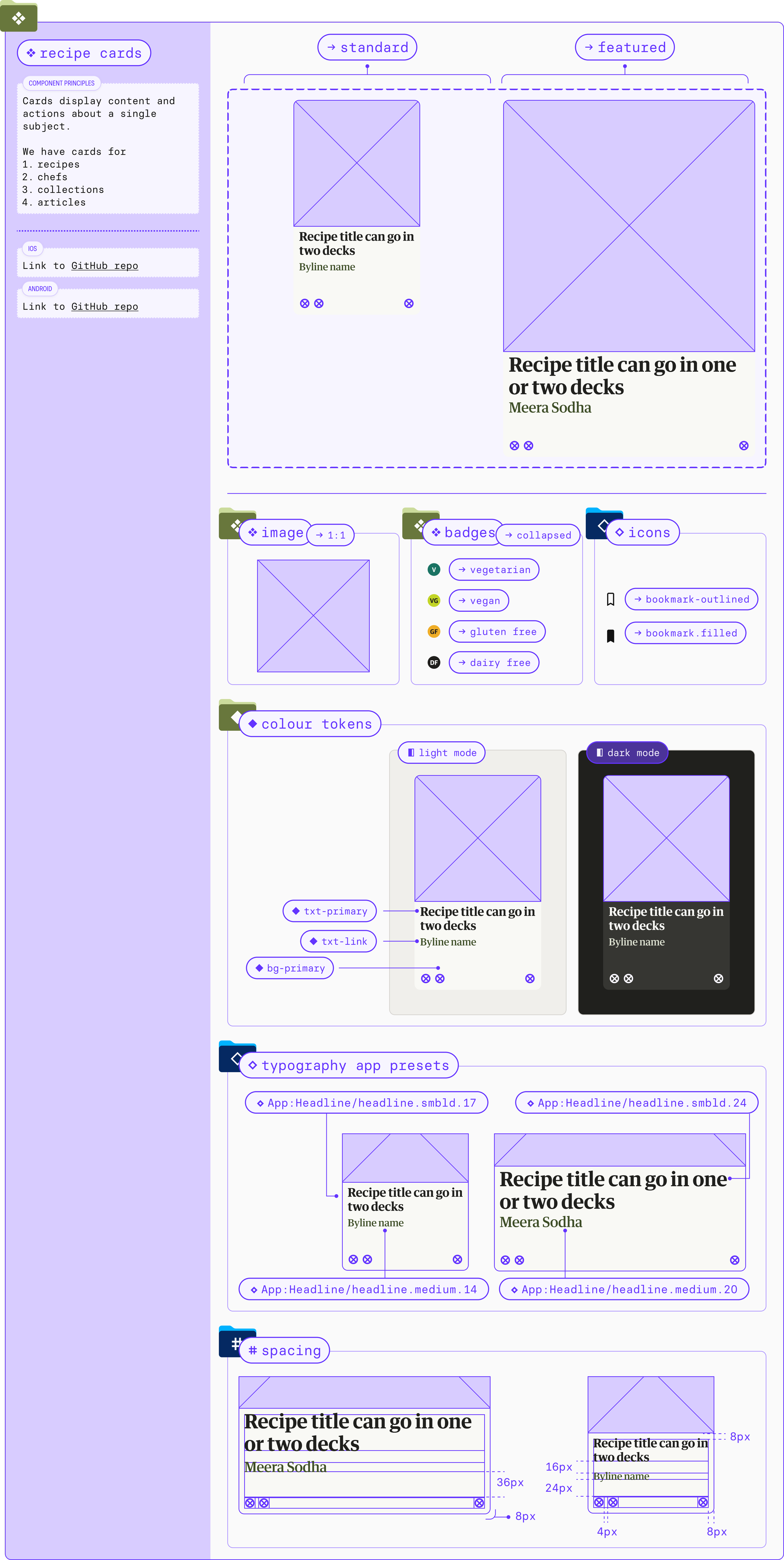
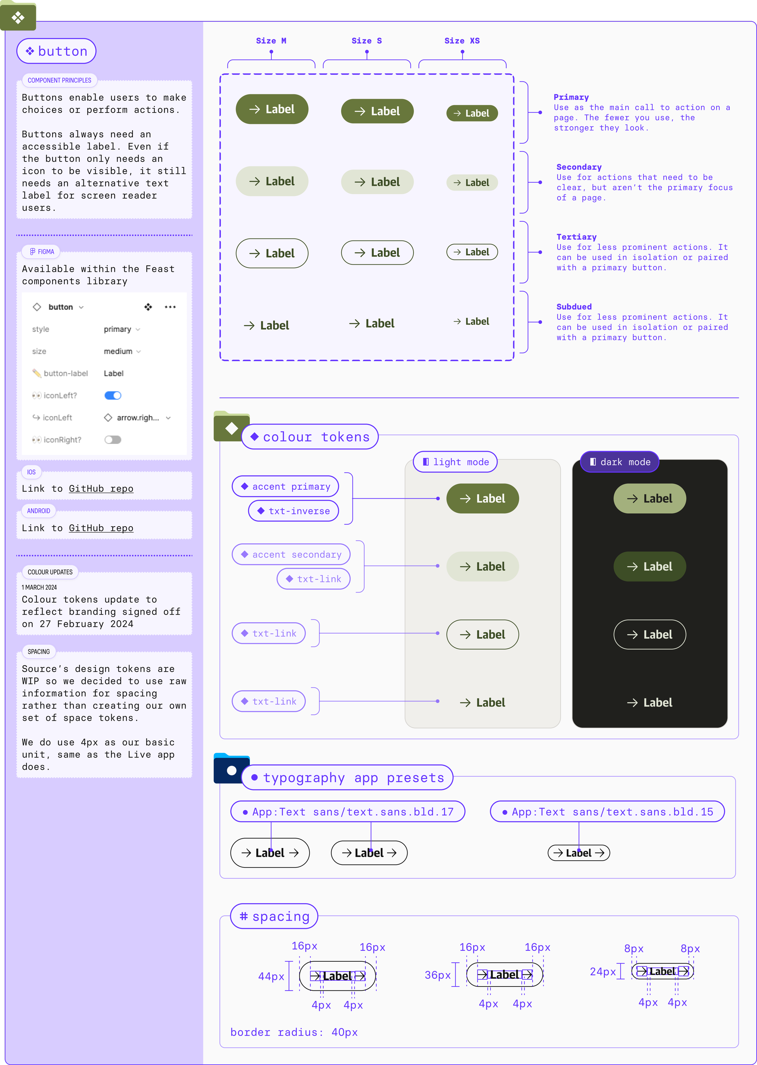
Components are reusable elements that have been created to work together. Each component meets a specific interaction or UI need.
Components in Feast DS may be generic or specific to each operating system: iOS or Android.
We build components using design tokens and foundations.
● foundations: colour
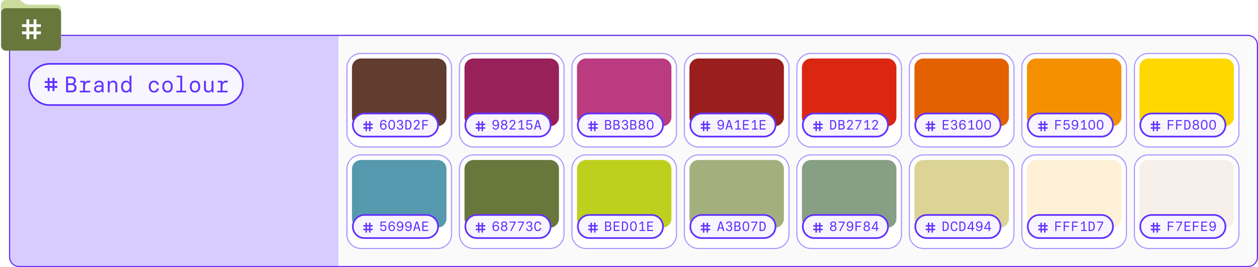

We were given 16 brand colours by the Editorial design team and had to convert that into a colour system that worked for the app.
Feast takes one of the brand colours to create the primary colour set for the app: tarragon.
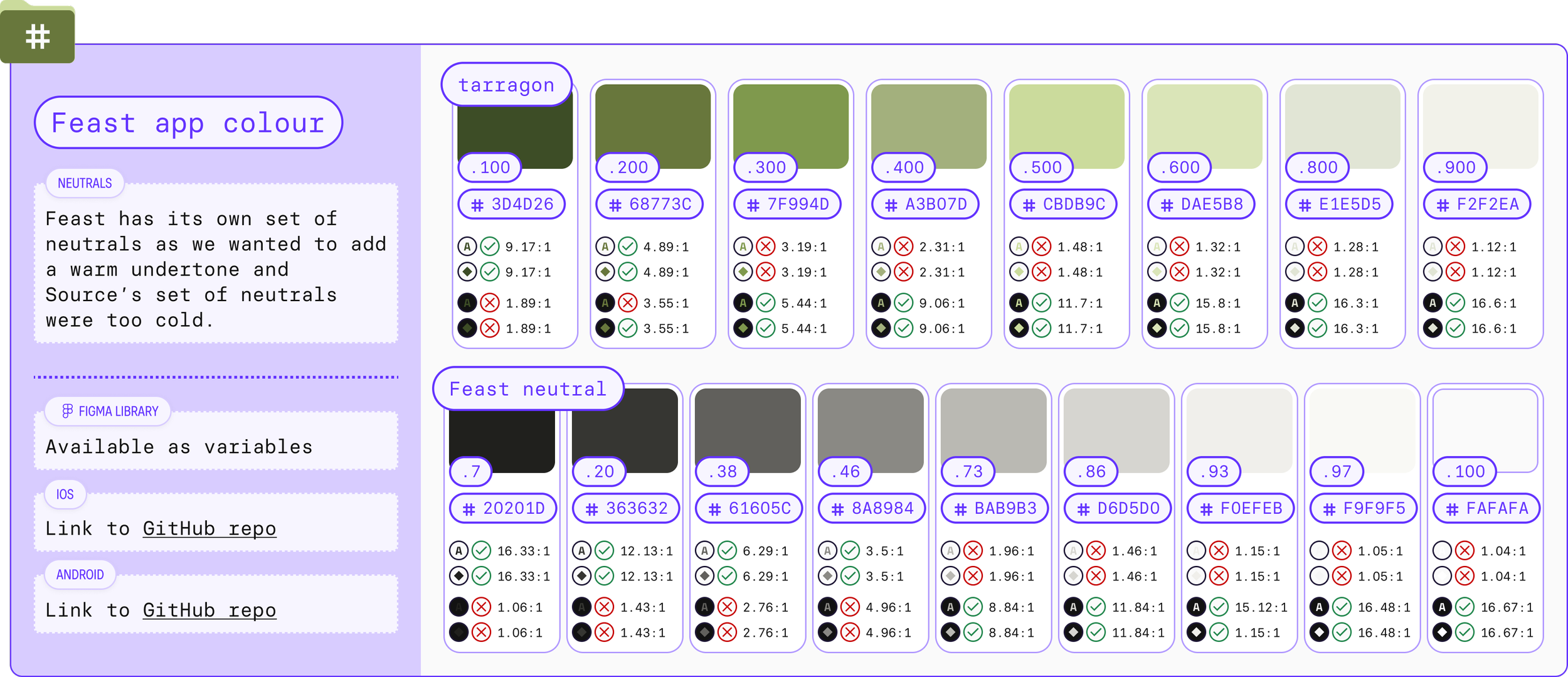
By organising the app colours in the same way as Source, we are able to —quickly and clearly— provide information like colour contrast, and keep consistency across the design ecosystems.
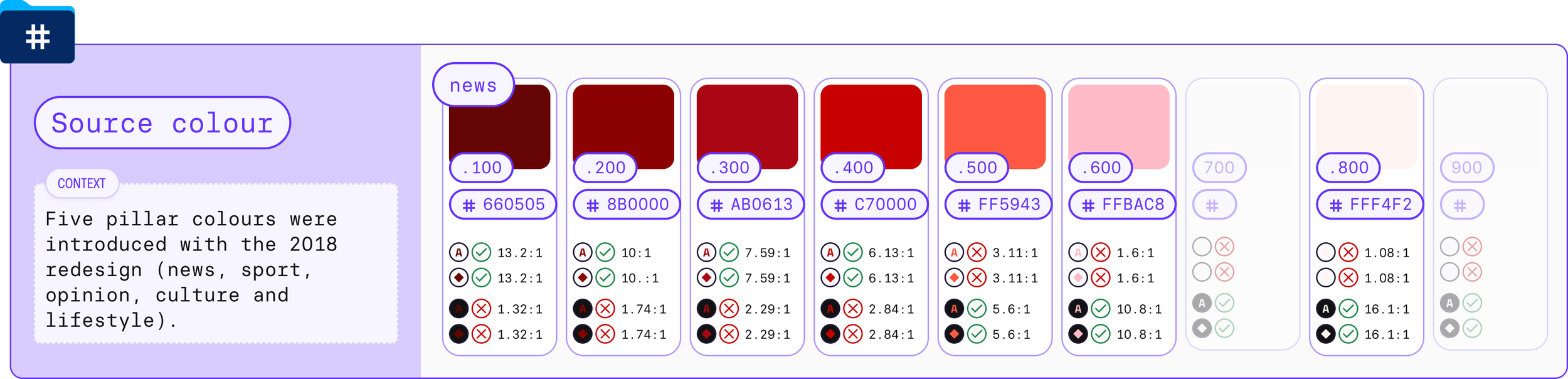
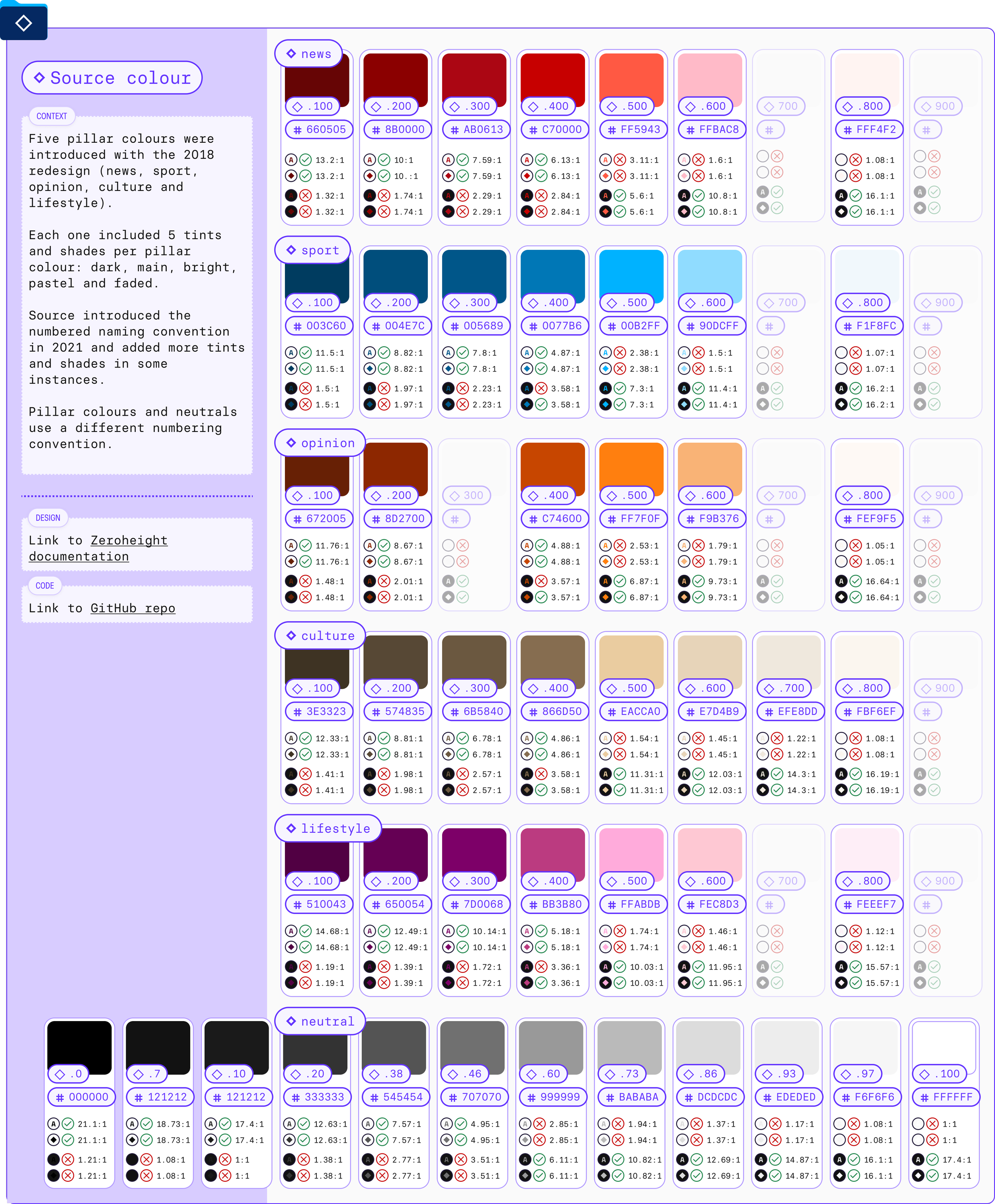
Source uses a .100 → .900 naming convention for pillar colours and .7 → .100 for neutrals.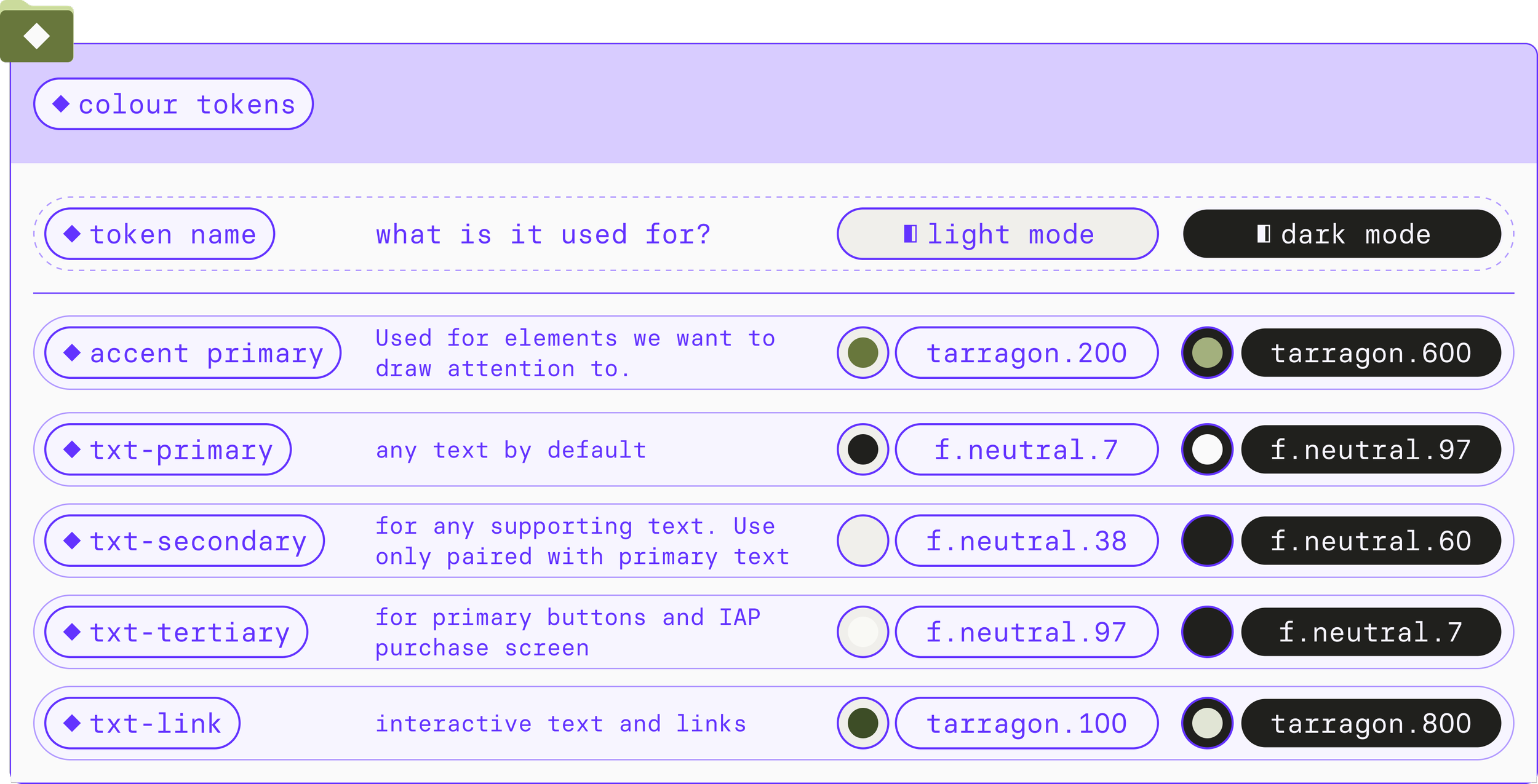
The design tokens are easily accessible to designers and developers via cheatsheets and the dashboard panels on Figma.The colour tokens are the same across Figma and both codebases (Swift for iOS and Kotlin for Android).
This enables us to make updates efficiently.
● foundations: typography
Pivot! Sometimes the first approach is correct and it works yet some small changes can yield big rewards.
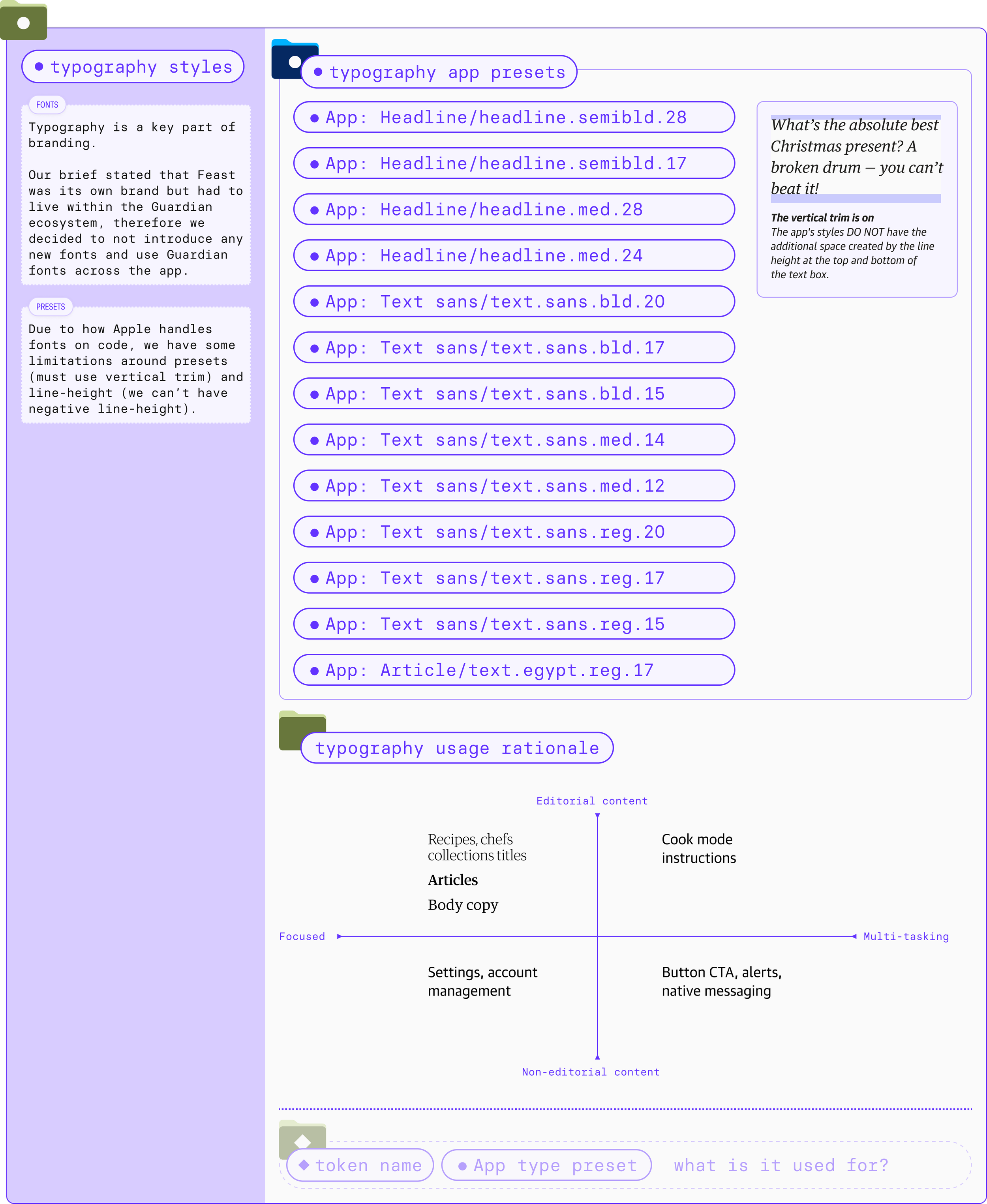
Figma styles document elements like typography, colour and grids and make them easily accessible as libraries to designers.
They are useful but aren’t responsive to modes (light/dark or mobile/tablet) like design tokens would be.

Initial approach: Reuse the app presets from Source.
These are available as styles in Figma.

Approach change: The Android devs requested we changed the typography set up from presets to tokens in Feast.
● components
Components may have different levels of complexity. By nesting components we are able to have full control of complex components and make quick and easy updates if needed.
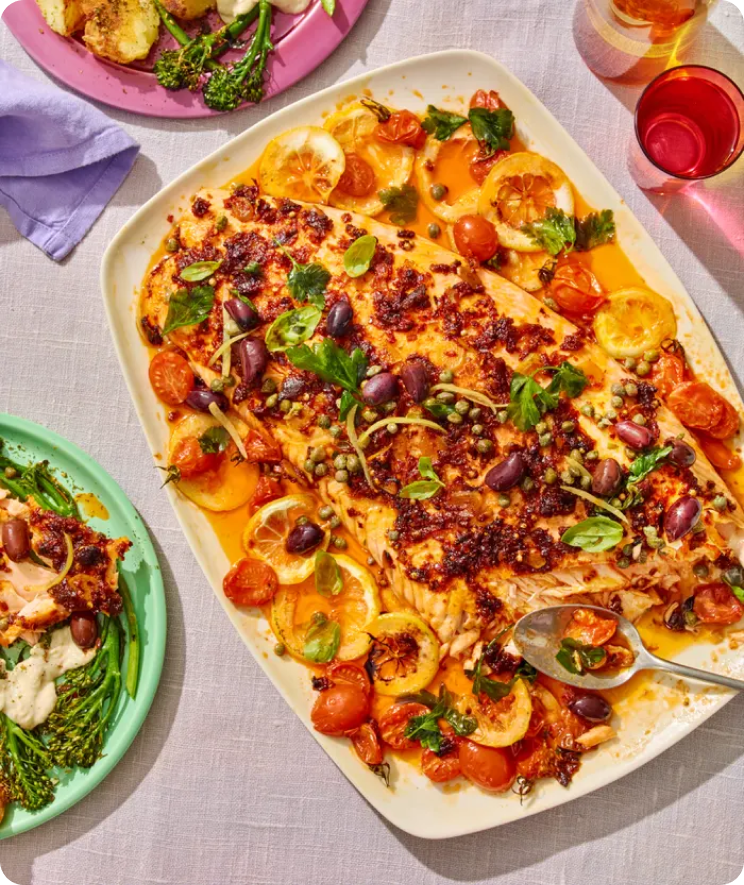
Understanding the commissioning and production process of recipe content within the organisation was crucial. We couldn’t make decisions based solely on UX/UI best practices, our creative vision and user needs. There was an added layer to the product where the vision of the food desks for the content needed to be translated to the product we were building.
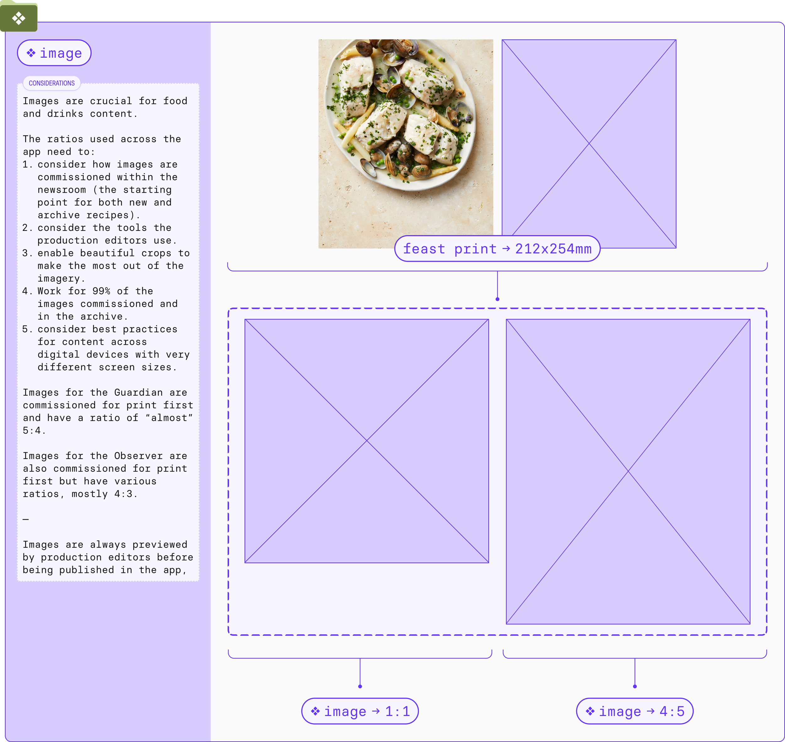
Some decisions, like the ratio of the images, were a collaborative process between:
● the picture editors (who commission the images thinking about print before digital platforms)
● the production editors (who crop the images and put the content together in the CMS)
● the product designer (who considers best UX/UI practices when it comes to app design and considers the creative vision for the product).
These changelogs were inspired by Figma Academy 2.0 and have been really helpful for the collaboration between design and engineering.Documentation is always important. But as the designer working both on the design system and the app, it was crucial that all decisions and rationales were documented:
to provide a history of decisions when new design stakeholders joined the team,
to help new UX and UI designers find what components where available in Feast vs. Source and where to find them,
to help onboard engineers easily when we had a rotation almost every quarter,
and because things moved so quickly, I knew I was not going to remember every detail in a couple of months.
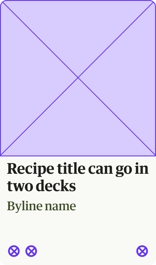
Component cheatsheets include information like:
component principles,
variant specs,
guidance on the elements required to build each component,
decision changelogs
links to assets like GitHub repos and trello tickets
● documentation
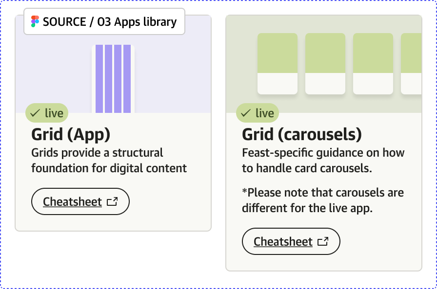
A design system index (see top of the page) allows everyone to have full visibility of available foundations and components, their stage of development, principles, variants and what their relationship is with the Source design system.
TIMELINE
07/2023 Project started
09/2023 V0.1 created
11/2023 V1.0 (internal beta deployed)
02/2024 V1.1 (external beta deployed)

Under active development and maintenance.
MY ROLE
Visual design for Feast app and Feast DS
Design system updates and Figma maintenanceCORE TEAM
Design: Ana Pradas
iOS devs: Ben Briggs, Daniel Okorwonko
Android devs: Michael Clapham, Simon HaleyWith design support from Akemi Takagi, Talitha Ferreira (Source DS team) and Luke Wilkins (Live app team)